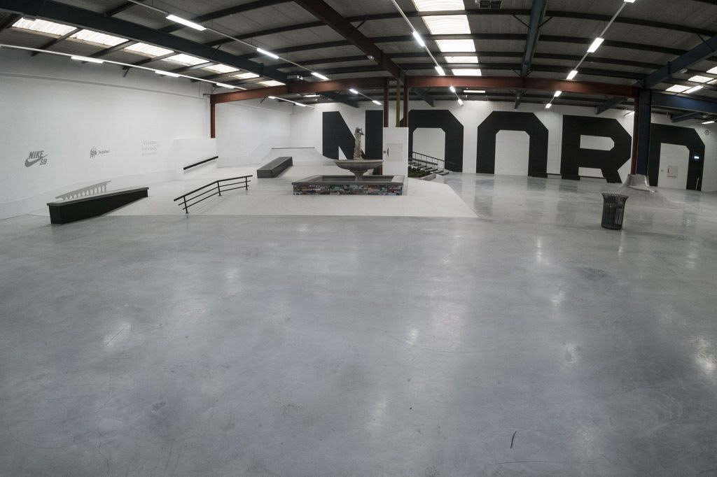
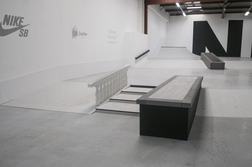
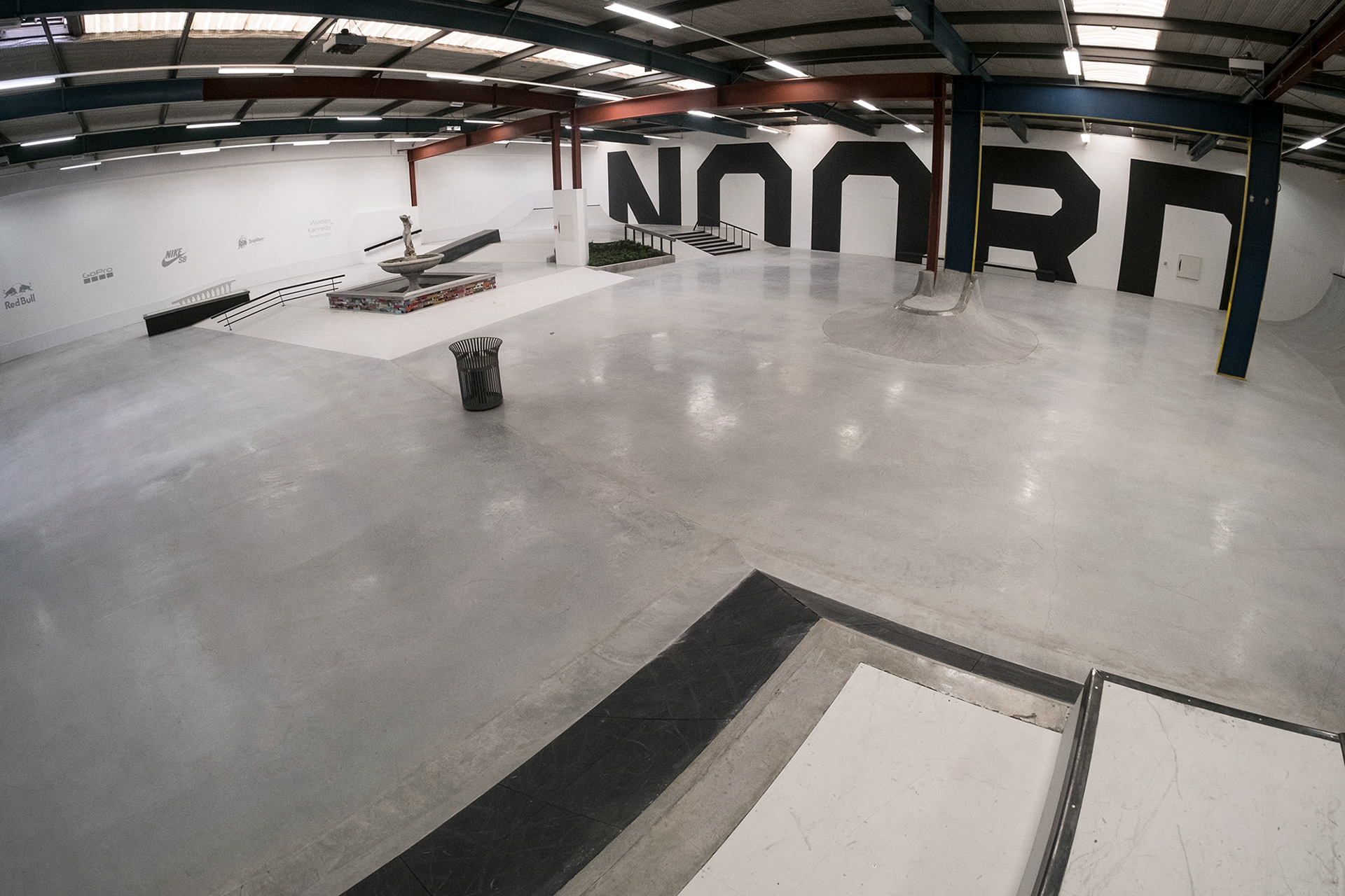
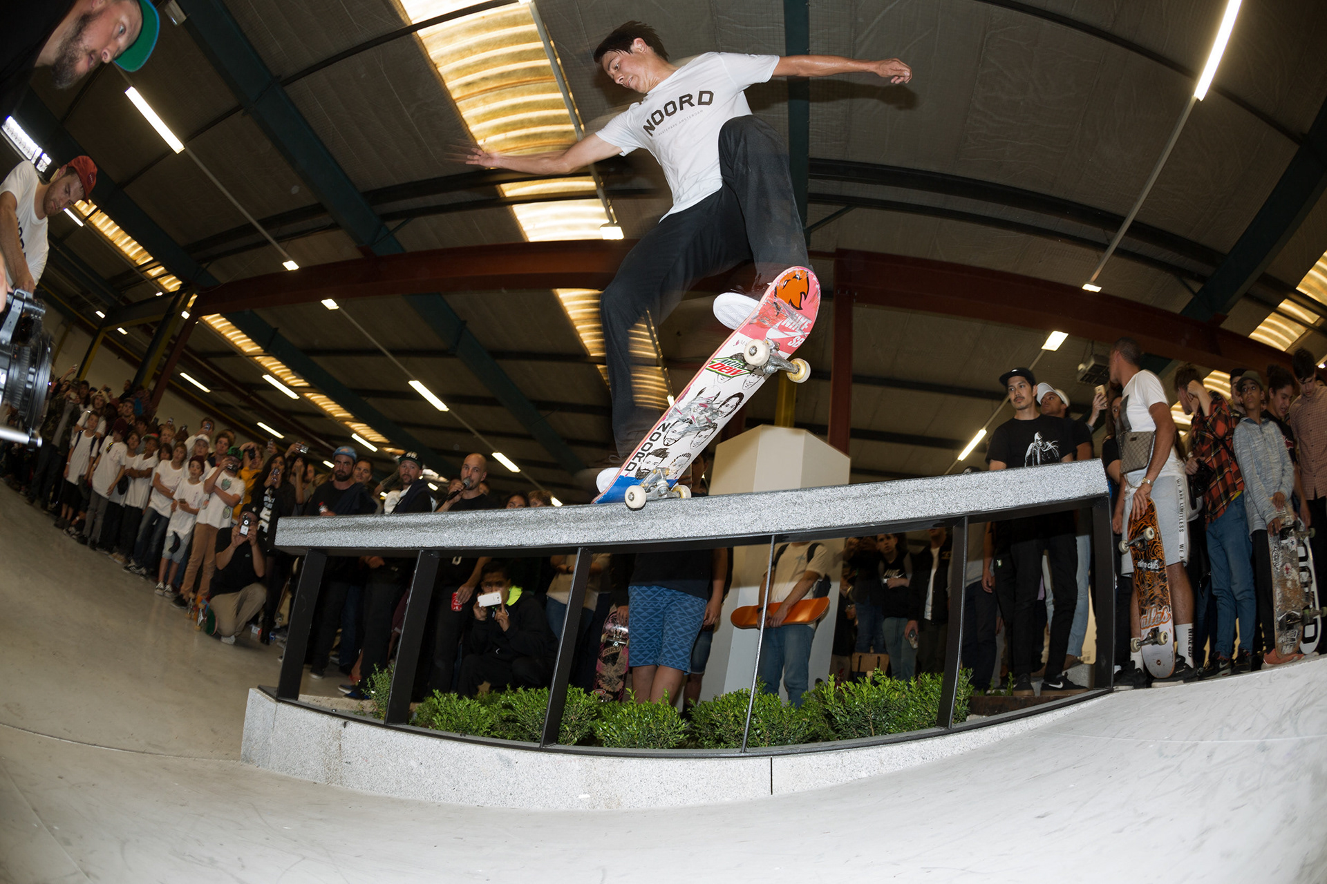
Helped reopen Amsterdam's only indoor skatepark—a community-driven project addressing a city where 200+ rainy days threaten year-round skating. This street-inspired facility expands on the original NDSM park with increased scale and infrastructure, including a Skateboard School cultivating the next generation of street sports athletes. Built by master builder Michael Groeningen and realized through collaboration with a dedicated crew of local skaters, creatives, and the NOORD community.
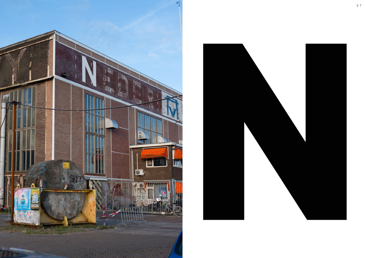
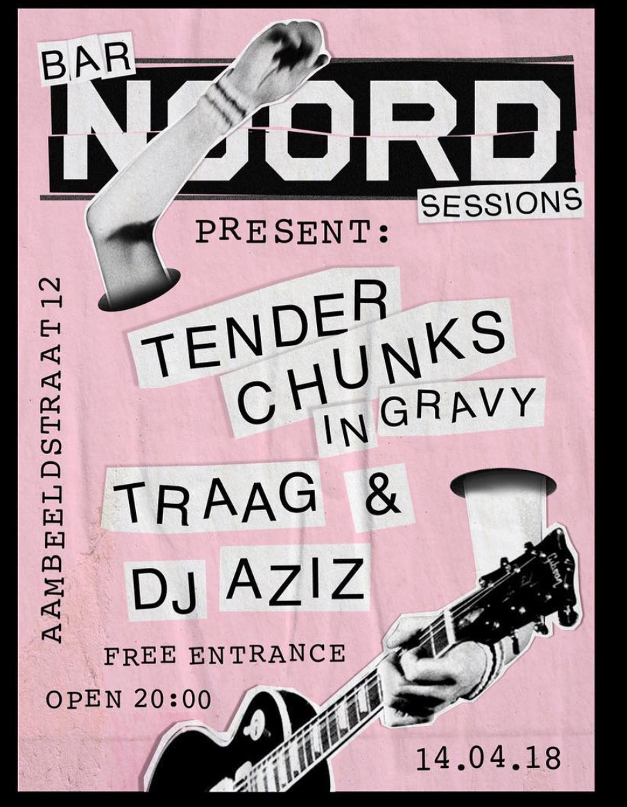
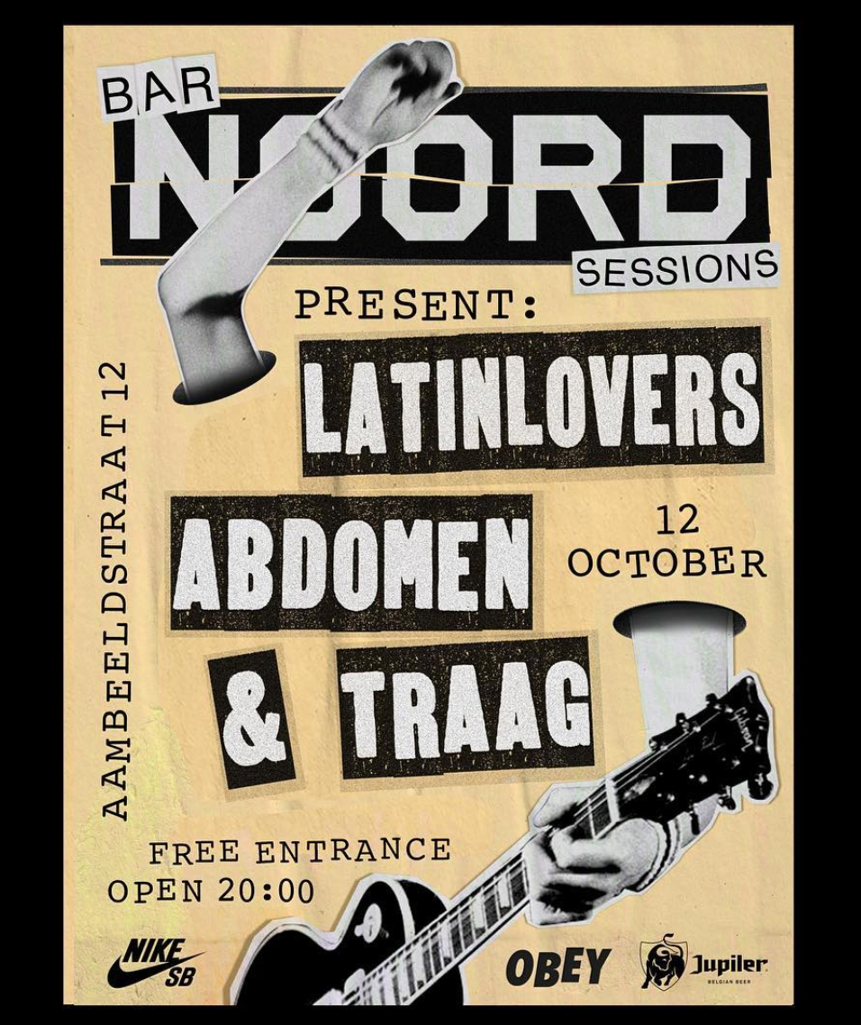
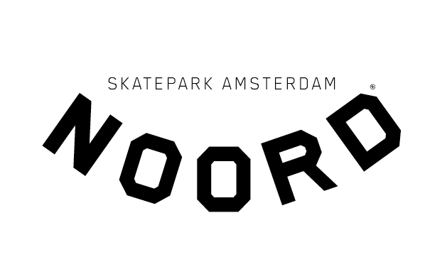
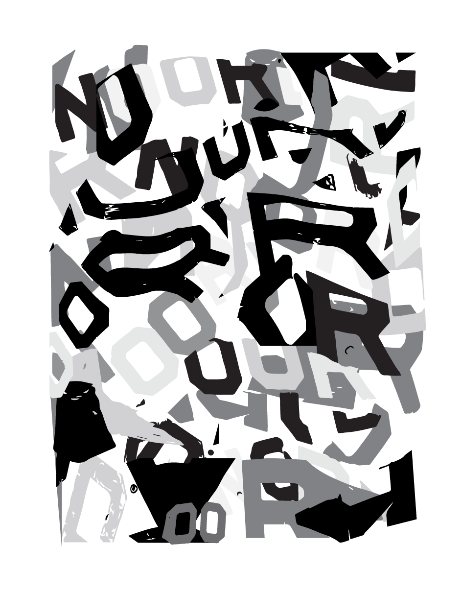
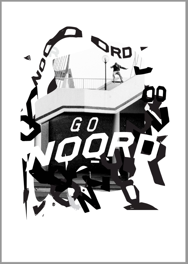
To build the brand we celebrated the NOORD heritage as a blood tie to the city by drawing inspiration from the typography where the old park was located, an old ship building facility. To kick a brand with a story to tell for the generations to come and with it's roots in noord holland skateboarding.
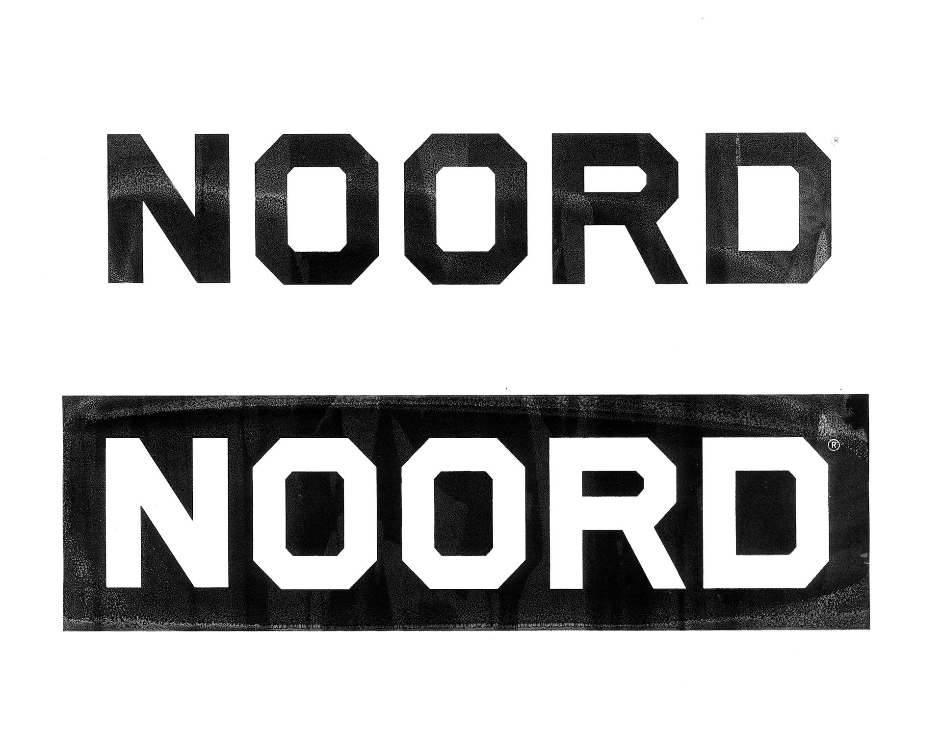
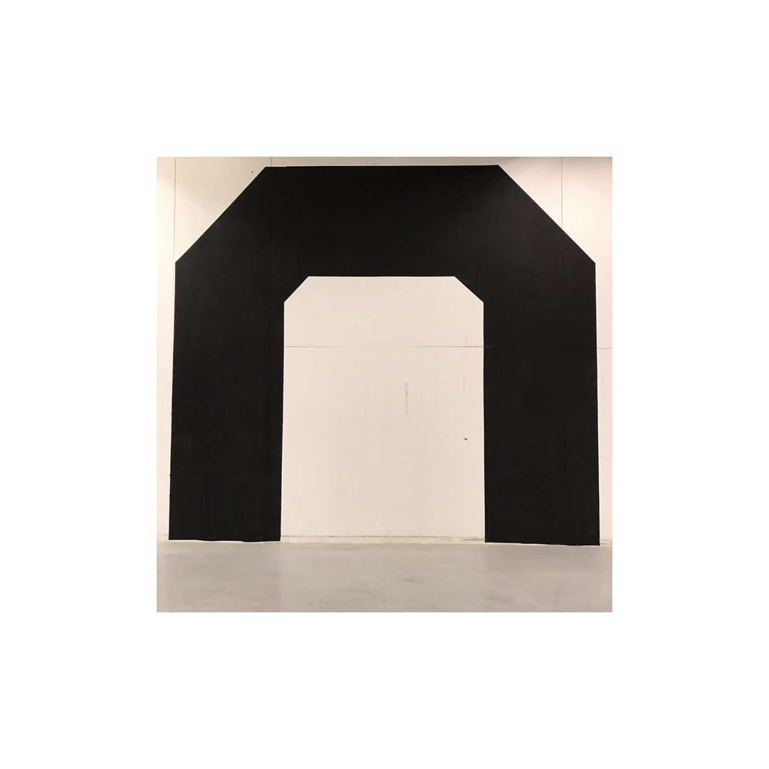
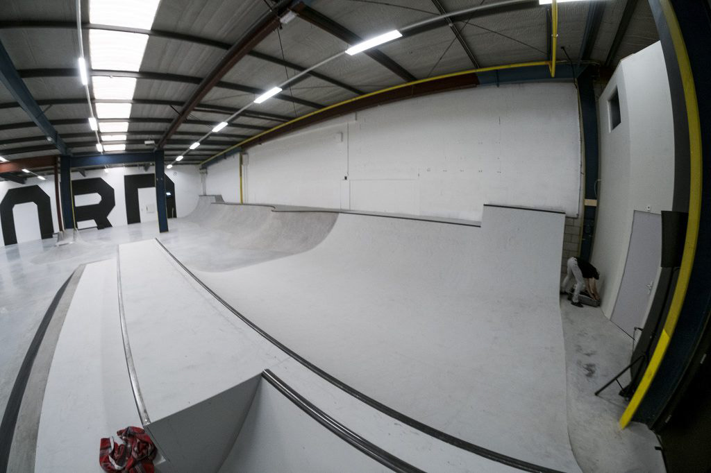
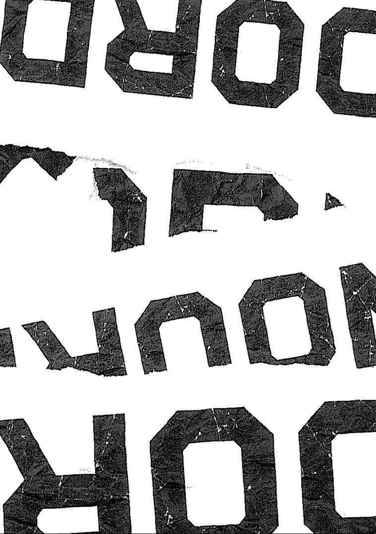
Above the building where we find the inspiration for the letters. And below the result.
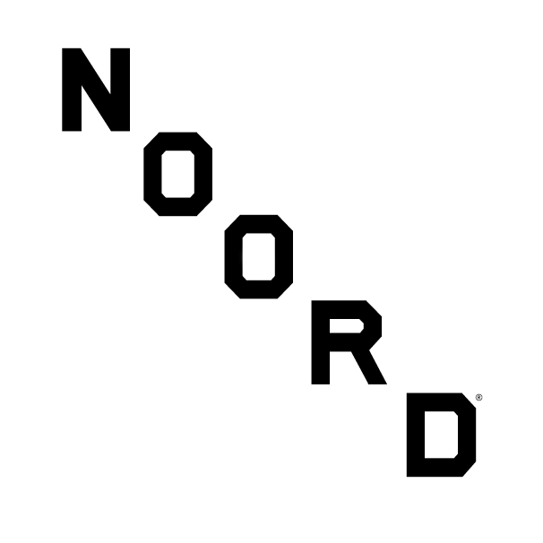
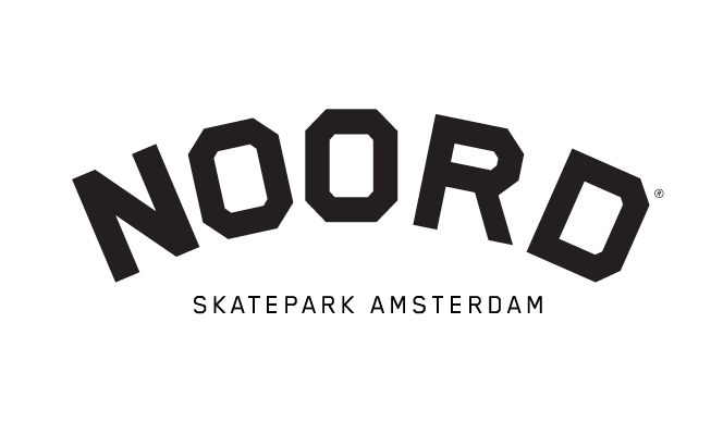
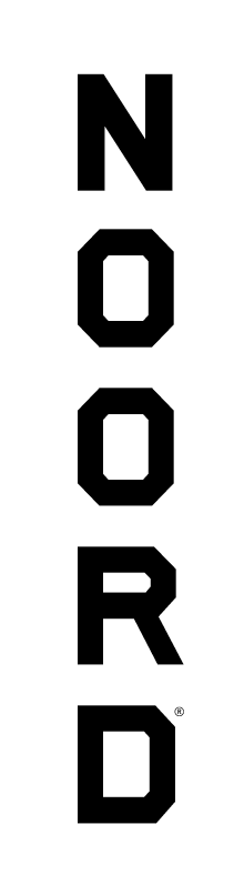
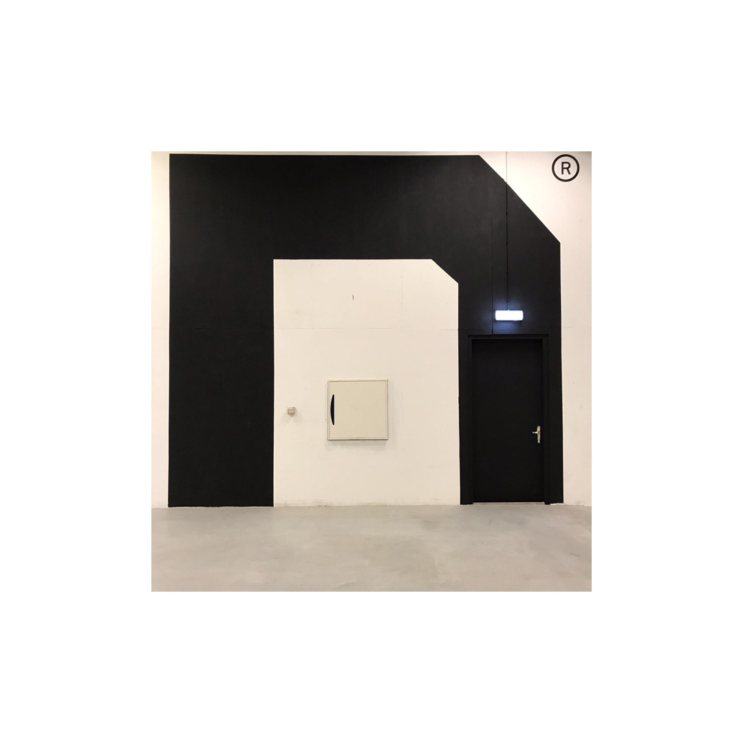
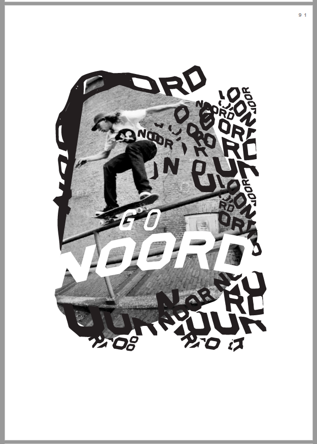
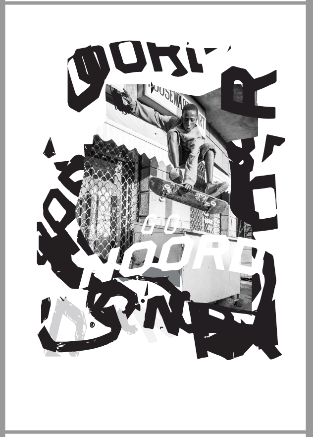
Made a few versions of the logo to make it playful depending on what media could be used.
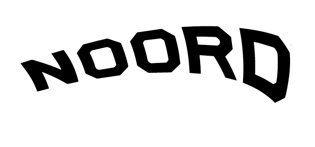
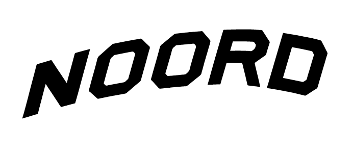
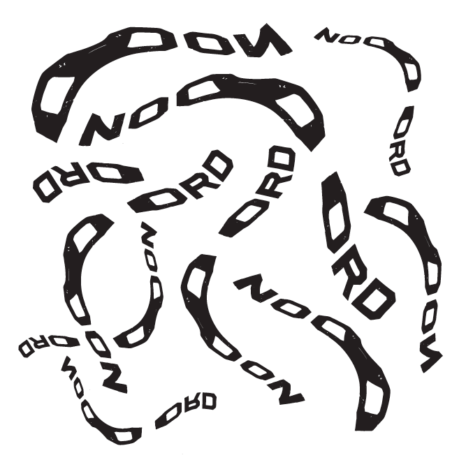
Gave the logo some flow for social channels and moving image media.

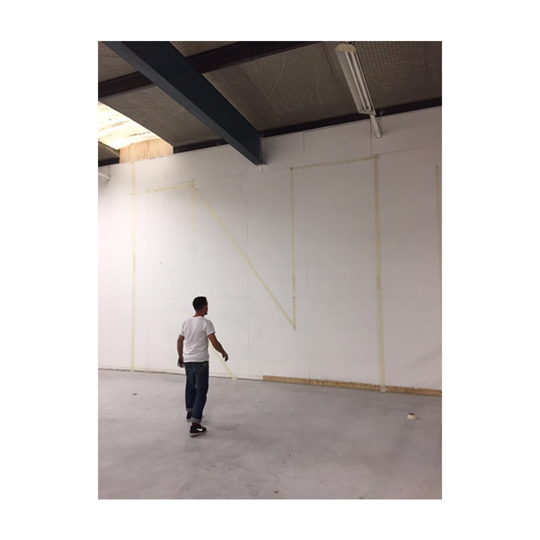
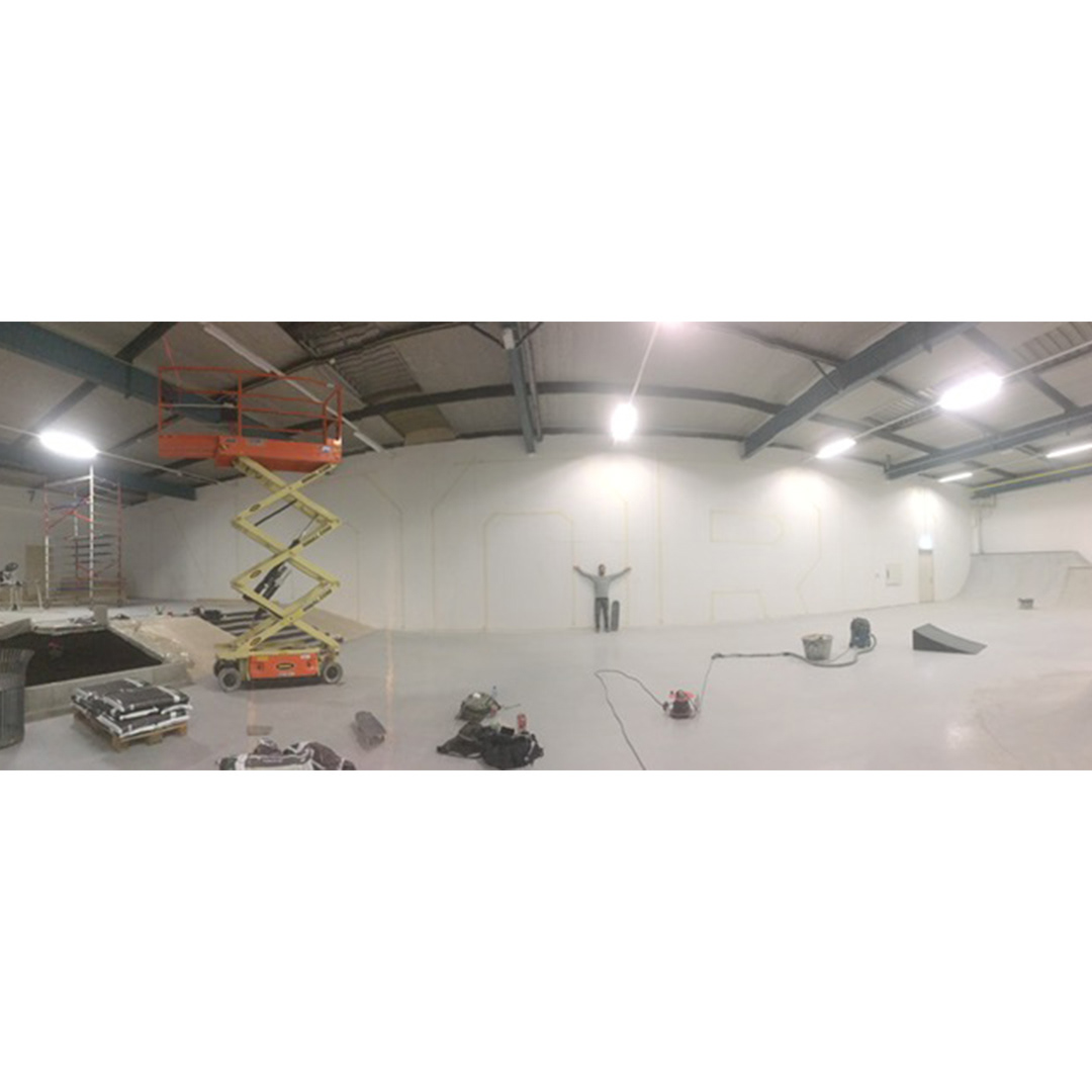
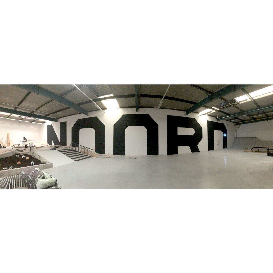
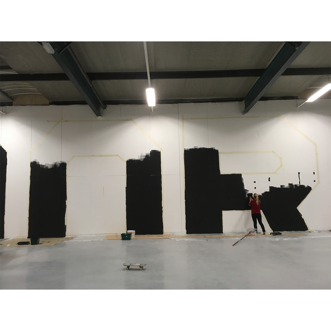
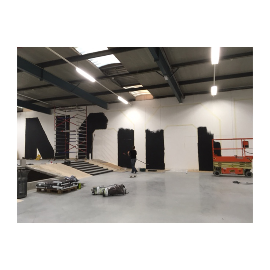
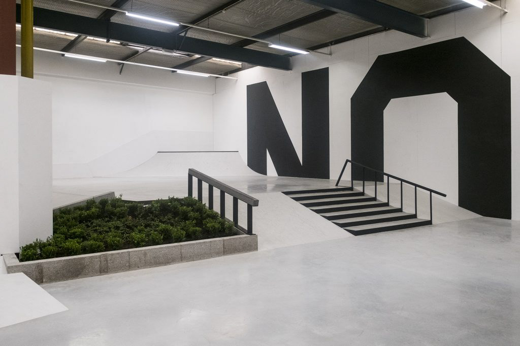
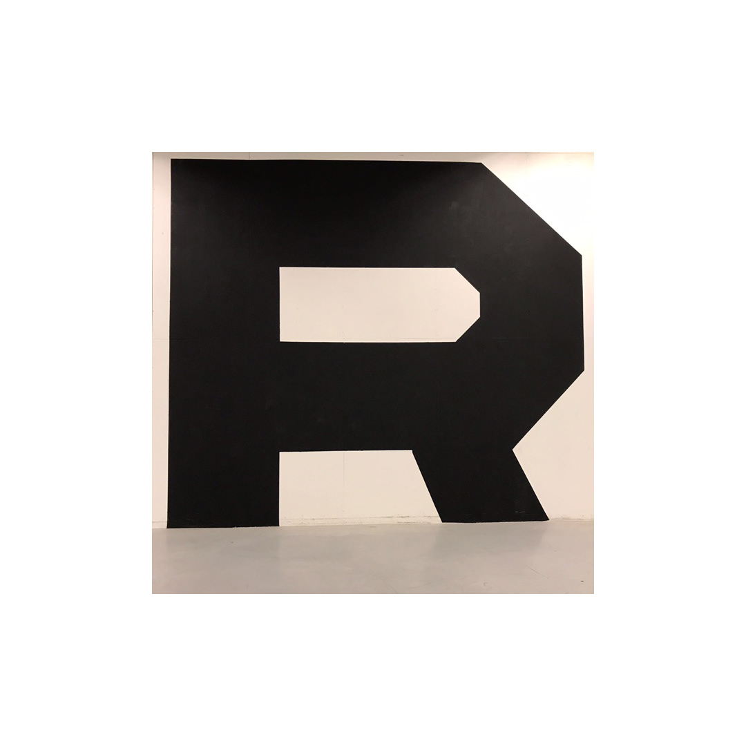
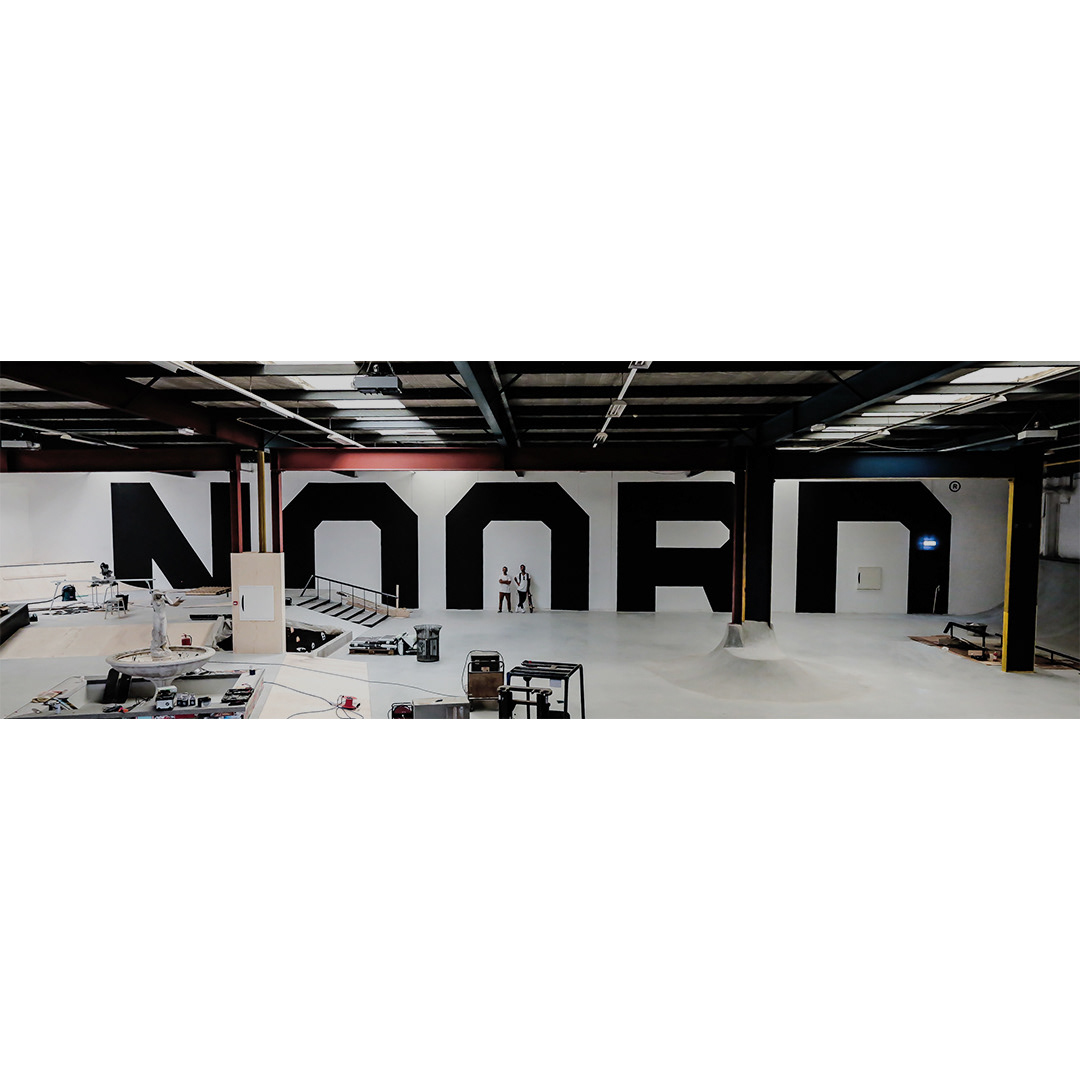
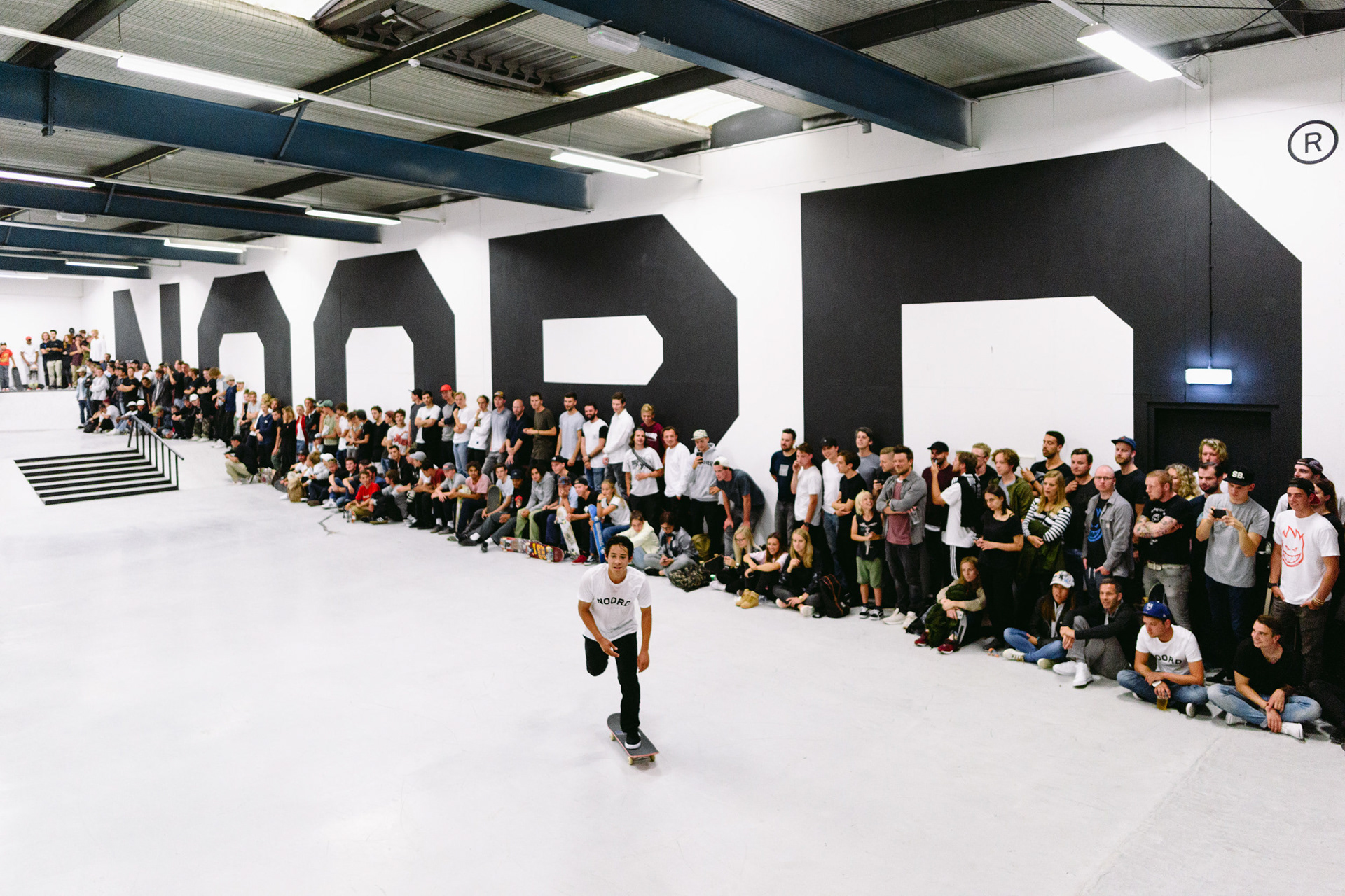
Below we painted a 60 meter long by 6 meter tall cropped version of the logo.
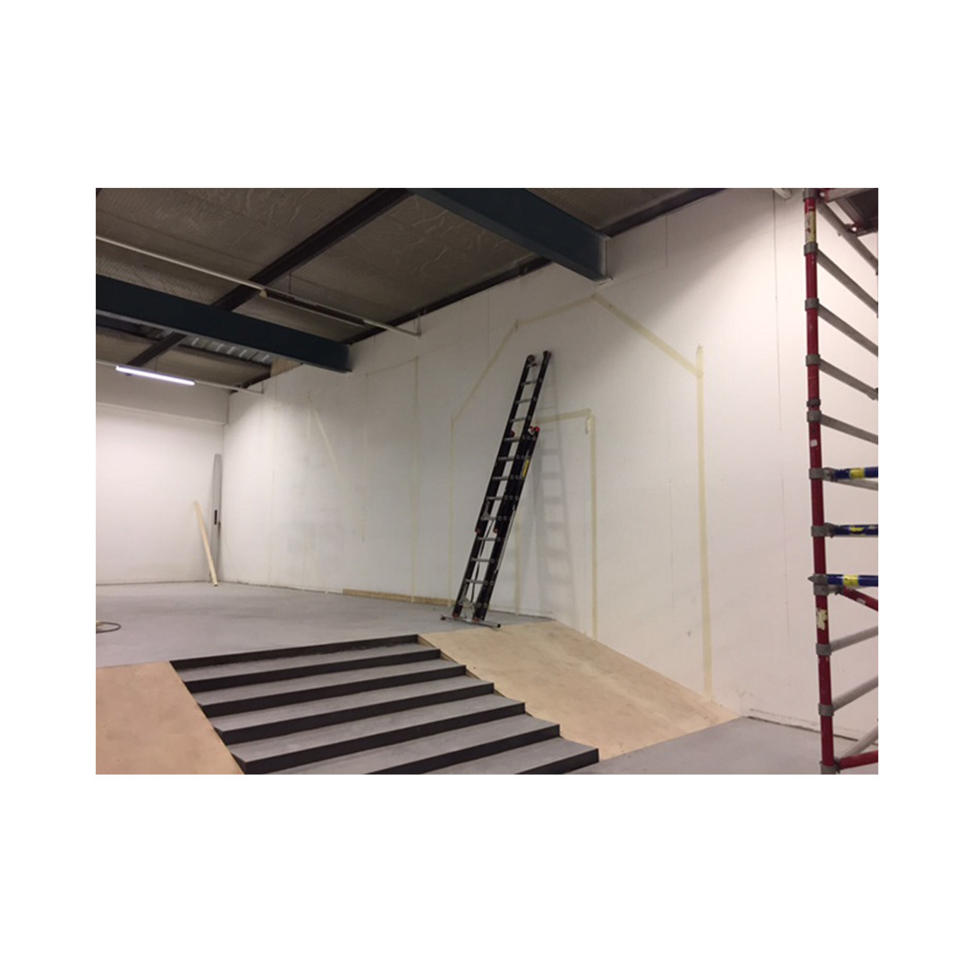
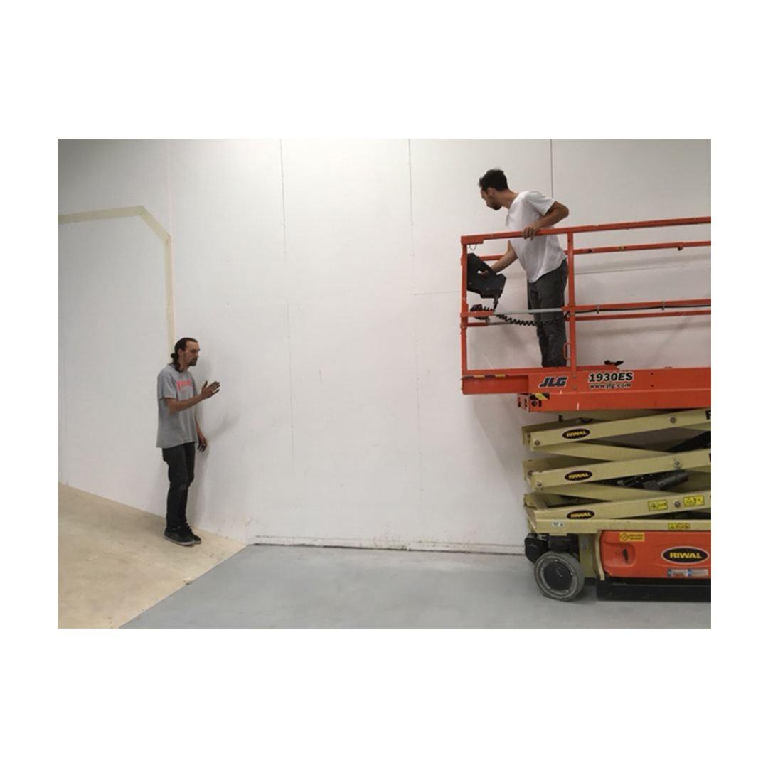
We didn't use any projector to draw the letters but just figure out the maths and then masking tape and levels.

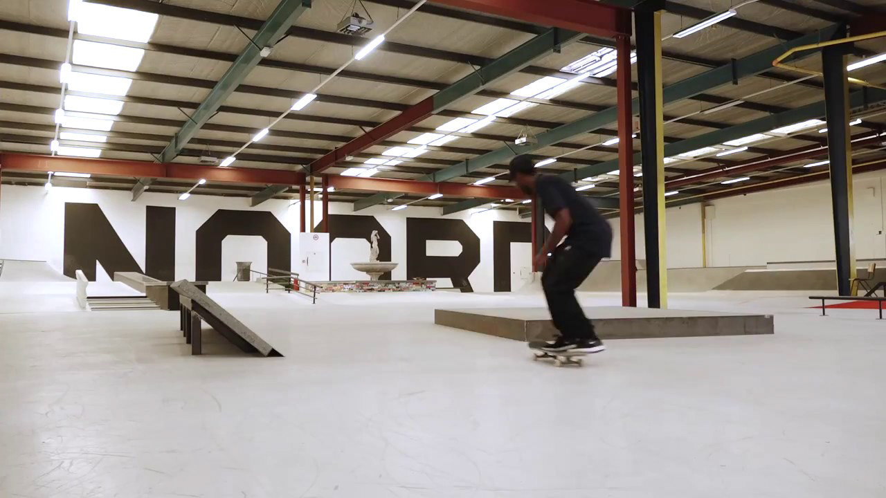
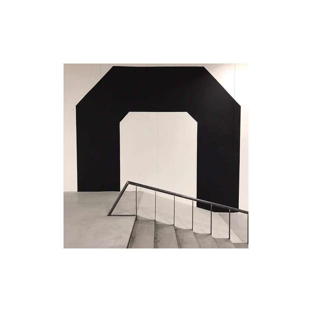
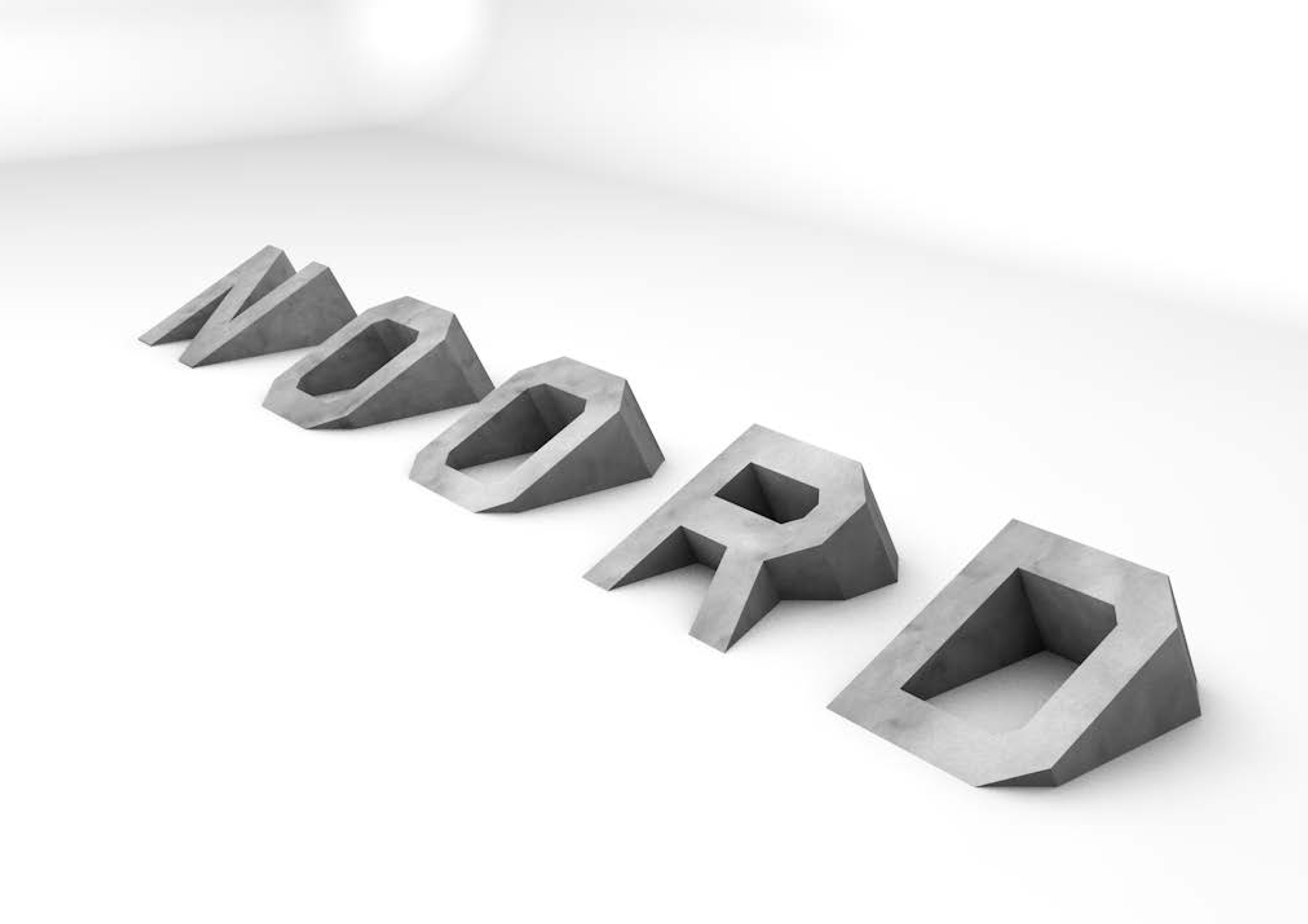
We extended the logotype to become skateable, by extruding the letters. (Still in development.)
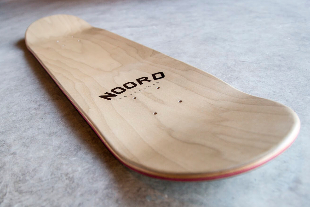
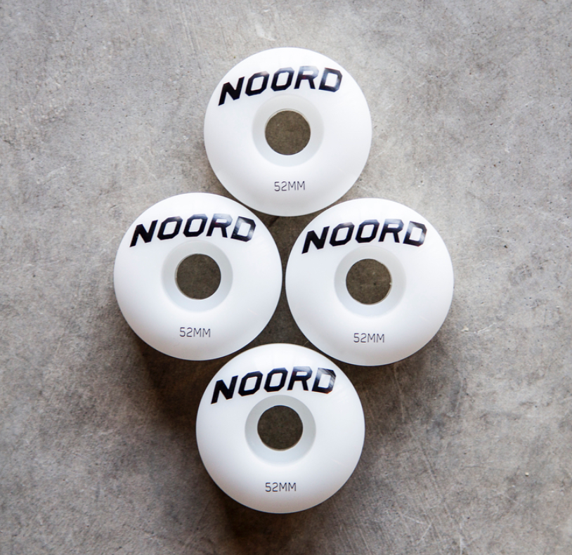
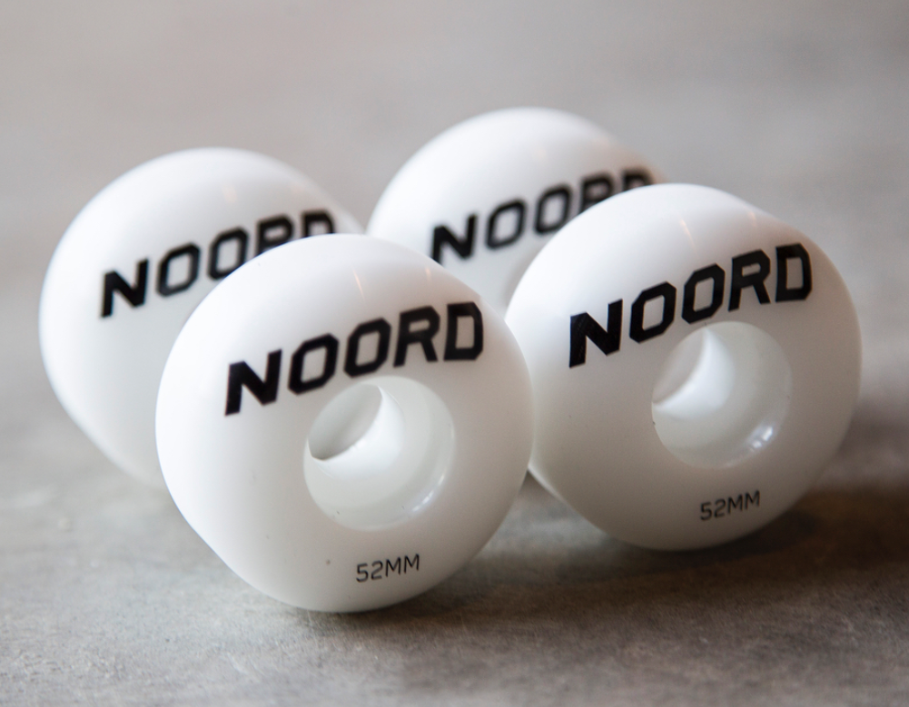
Logo made it to a board.
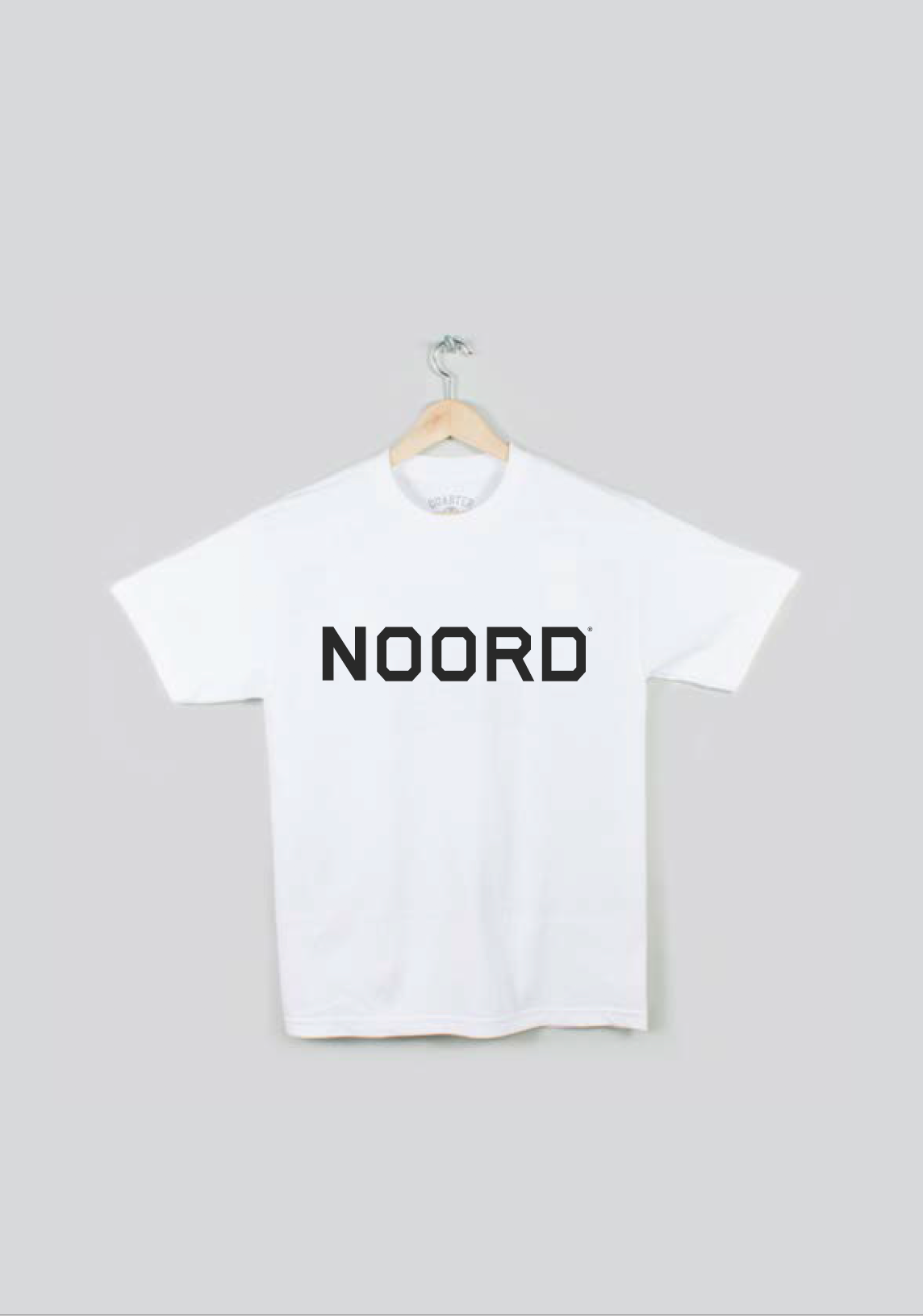
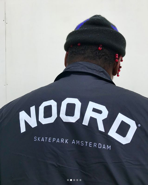
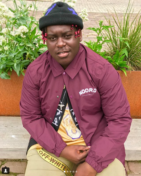
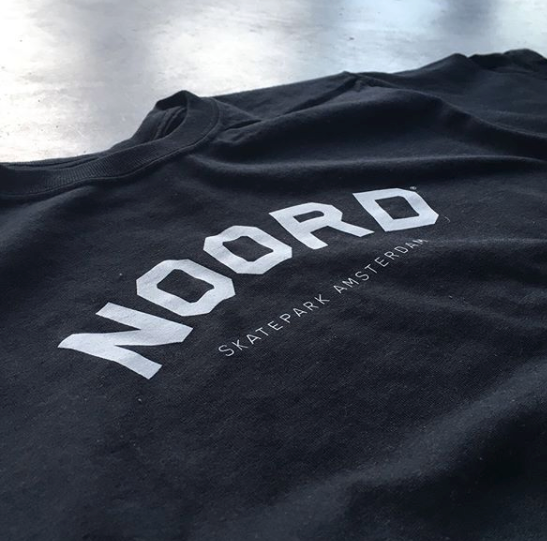
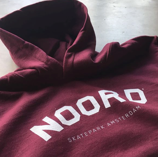
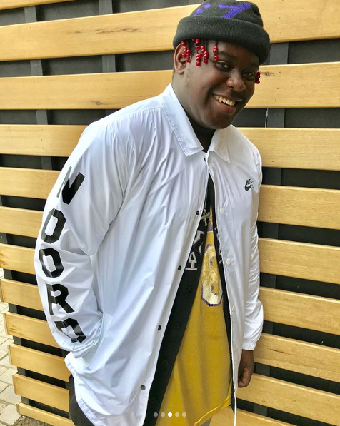
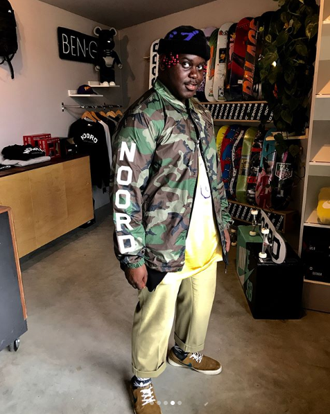
Some apparel examples.
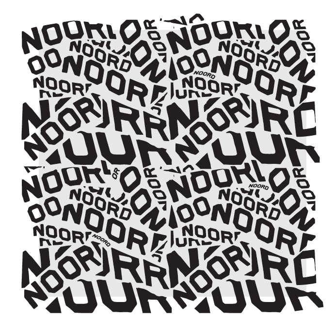
We made patterns with the logo to make the logo more dynamic. And explore adding imagery within.
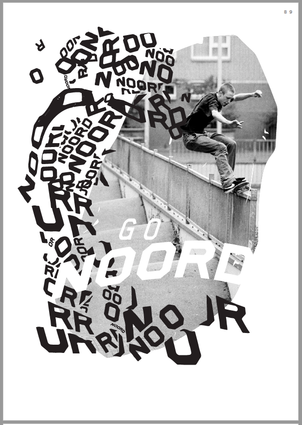
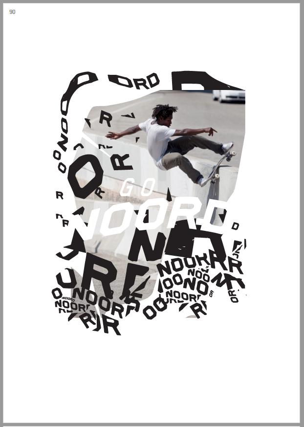
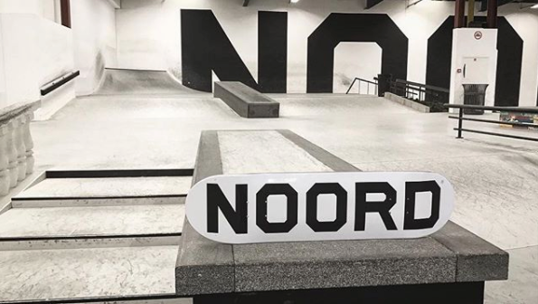
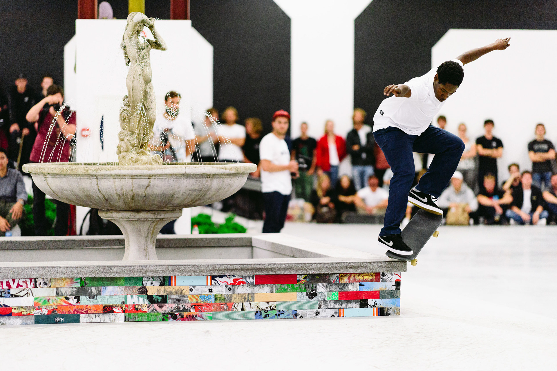
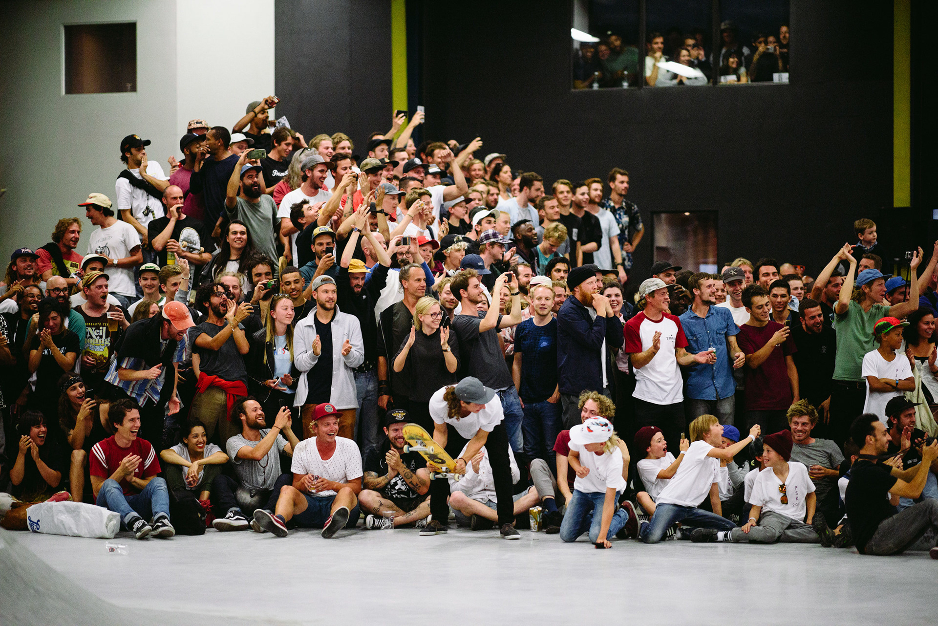
And below more coverage of the opening day with the Nike SB team.
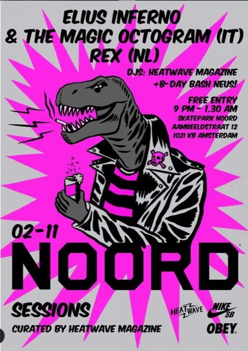
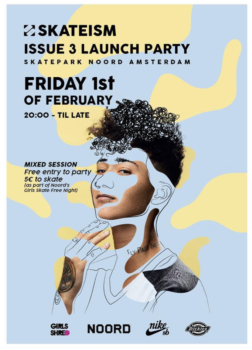
NOORD today is becoming a lifestyle brand and a creative platform around skateboarding culture.